Monday, 20 October 2014

Surface Pattern


Surface pattern 


 This is my repeat pattern that I have created. I found it interesting because i have never done anything like this before.  I think that the outcome of this has came out  bright and nice. I think this because it could be a page in a children's book or an new cartoon. If I had more time on this, I would of created different aliens to creat a space atmoshphere.

First of all, I had to draw an design in the center of the page while making sure it does not come off of any of the edges.
Next, I had to cut my page in half and make sure that the pages are the same size as each other. After that, I then stuck them back together inside facing out.  Then, I had to  cut it again, flip and rotate it and stuck it back together again. Then, I had to design, in the corners, and I had to then fill in the empty spaces. Finally, I then filled in the colour and then photocopyed it 4 times to stick them together for the last time. 


  This is my rangoli pattern.I think that it has came out really bad and it could be a lot better. On the other hand, it was fun and it makes you think about if the pattern is going to work or if you have to change a little bit of it.Even though it never came out that good, I really enjoyed trying it out. It was hard to keep going the outline on the tracing paper though. This is because the outline keeps on getting darker and darker, so you forget where you have traced over.


 This is some of the Batik's I have done. I Think the outcome of these ones are terrible because they were my first ones that I have created. I really enjoyed using the hot wax  because it was good to use something else than a pen or pencil.I think that the colours that I have used were ok, but I could of used better ones that mixed more better. 


This is a Kimono dress that  I have designed for the women in Japan. I wanted to created a design because I found it really weird of the upbringing or Kimono girls in the past and I think that their clothes are really pretty, colourful and amazing.The outcome of this deign has turnt out alright but i think that it could of been better. I really like the purple against the flowers, but iI think i added too many flowers.


This is my zellige design. I really like Zellige designs because they are only allowed to be certain colours. I think that the outcome of this has turned out nice, but the colours are too bright. The shapes were hard to angle in the correct way because I have never tried this before so I am not used to it.


This is my drawing of Anna's dress from the film Frozen. I wanted to include this because Frozen has got a lot of patterns included in the film. Anna's dress has got a really pretty pattern on it and it is really natural. I think that the outcome out this drawing has turned out really nice. This is because it looks like it.


This is my batic scanned and photoshoped in different effects. I think the outcome of it has turned out really different and nice. They are both different to each other and bright


I am now focusing on some tattoo designs that have patterns in. These are some of the designs that I have created. I tried to mix tribal tattoos and mark making together. I think this flower tattoo has turned out okay but it could of been better. It would of been better if the flower petals were even instead of one odd one out.


I like this tattoo design that I have done. This is because you have got to have a lot of faith in this world and a rose represents faith well because a rose is pure and beautiful. I think it is a good pattern tattoo because it is in tribal style..


This is my version of Mini Mouse in tribal art. I think that the outcome of it has turned out really cute. It would be the perfect tattoo for Disney and Mini Mouse lovers.


This is a love tattoo that I have designed. I think that this design is perfect for couples who have been together for a long time and who wants to get the same tattoos.


This is a tattoo that I have designed for mothers who have had a miscarriage or who have lost a child through an accident. I think that the outcome out it has came out ok, but it could of been better.


This is a butterfly tattoo that i has designed to represent freedom and nature. I think that the outcome of it has turned out alright. The outline could of been more sharper and it could been designed more better.
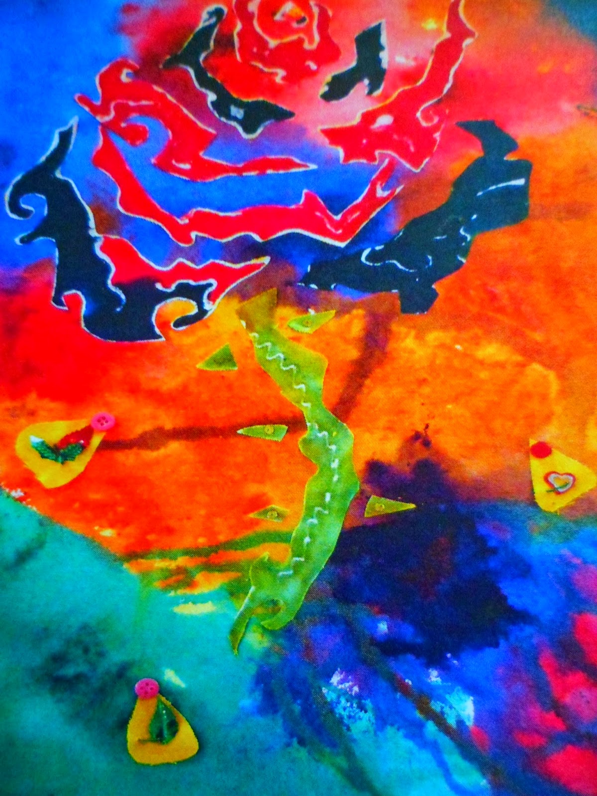
 

This is my final piece on this topic. First of all, I created the rose using Batic. Then I had to cut it out to stuck on a bright background. I think that the outcome out this has turned out really bad. I should of put it on a pillow instead.

Tuesday, 25 February 2014

Painting


Painting topic 


This is my front cover for this new painting topic. I think the outcome is ok because it's really colourful, just the way i like it. I messed up quite a lot though, however i did manage to fix them up and they are now less noticeable.


We then had to complete mini tasks such at: blending colours (Acrylic samples), draw/ paint an apple and an object from the box. I  have choosen to paint a blue bottel for this. This is because it made the reflection shine off a lot and there were more than one shade of blue. I didn't really like doing this because sill life aint really my strongest side, but i did when i got into half way of  painting them.


Compostion 

This was an interesting thing to play around with them, the teacher said we have to cut up shapes all day and change the size/ the way they're placed, I didn't like the idea of this at all. I thought it would be boring and the day would drag, a lot! However, i actually shocked myself by getting stuck into it and the day went pretty fast. I would never do it again though because it takes ages. After that, i then reversed the shapes that I have done on the photocoppyer. I think the outcome of all of them has came out alright and i could see them on a advertising prodject.


We have now moved onto water colour paint. We have been focusing on the effects that lighten can make and the different angles that they can be in. I think that the outcome of them could of been better. I think that they could of been better by adding more detail, focus on the lighter areas more and do the correct outline first instead of going straight into it.


This is my watercolour stretching attempt. I think that the outcome of it came out really, really bad. This is because i'm not really good at painting and the colours kept on blending into each other too much.


  This week, we have been looking at the different effects that you can get depending on the surface you choose to paint on. So we tested painting on the brown and white side of the card using oil paint. I think the outcome of it  could of been way better and i could of added more layers to all of the pictures.


This picture was done by  mixed media. I used oil pastels, watercolours, acrylic paint, oil paint and tissue paper. I think that the outcome of it has turned out ok, but could of been better. I used a big brush when i used the blue paint, so it ruined it a lot.


This is a watercolour painting that I have done. I think that the outcome of this is ok but it cold of been better. I hate the way it smugged and blended into the blue.


This is a paper design of my final piece that I have done. I created my final piece with a smashed up plate and painted deign in the background. I think that the outcome of this has turned out ok but it could of been better, It could of been better by doing better designs and more planned out.


Tuesday, 12 November 2013

Computer blog


Stencil Art

This is my Disney stencil i have made. I created it by using different tools on Photoshop. First of all, i went onto the adjustments and then the Threshoid tool. Next, i went on filter->Artistic-> Palette Knife. After that, i used the move tool and dragged it onto the other image. Finally, i used the transform tool.


This is my silhoutte picture. I used some tools like: adjustment tool, inverse tool, magic wand, quick selection tool and more. I hated to this because i could not  get to right. 


This is my attempted at the tag graffiti. I have used a mixed of tools such as: paint tools, adjust stroke and free transformation tool. I did enjoy this activity until it messed up. I think the outcome of it is ok but i do want to try this again, although with the drawing mat instead of the mouse.


This is my 3d concept and Techniques try out. I had to use a lot of different tools. I found this more better than photoshop because its more easier to find out where the tools are. I had to used as mix of tools such as: the move tool, new materials and refection. 


This is my second screen shot, but this time, i'm moving around the camera and playing with different views. I really like this one more because it is way more different than the first one and i think it looks more better.


This is my ipod using cinema 4D. I really enjoyed using this because it was fun to try something different and i didn't get stuck this time. I have used a lot of tools such as: primitive object menu, attributes manger and material editor.

This is my first attempted of making a perfume bottle in Cinema 4D. Some of the tools i have used were: front view, akima and lathe nurb tool. I have enjoyed using this program and i find it more easier than using Photoshop. 

I have then experimented with making it more of an glass effect. I kind of failed a little but it looks pretty cool and very ordinary. I like the colours and the refection it have got though. 

I have then created another one by copying and pasting the first one i have created. I first had to group all of the tools i have used though. I like this view because the blue reflection is on the red bottle and the other way around too. I think because of this, they both look more connected and looks more pretty.

For my final screen shot, i wanted to move the second one i have done and add more light in certain areas. I really like this one because the reflection is the same as the previous screen shot. Also, the reflections are more interesting. 


3D digital media


   We are now researching about 3D digital media. I have picked lilo and stitch because was and still is my favourite childhood film. I really like this picture because it is edited with a picture on top of each other. It makes the characters really stand out, as well as the colours in the background.


I have picked this design because it is pretty and interesting to look at. It is also like it is escaping the screen. I think it is a good example of exploring the different 3D digital media because there are so many different ways.


`I think the film the " Avatar" is a good example of 3d digital media. This is because it is an mixed film with real life and 3D media.  I find it really good how they have combined the two together, didn't make them mix  and make the 3D so realistic .


 Crash bandy coot is one of the best games for 3D digital media to m e. This is because It is such and addicting game and there are more than one game. 


Final Fantasy is one of my favourite games . It is on a lot  such as: psp, ps3, PlayStation and more. I love it so much because the animation clips they have in there are so realistic at points. Definitely in Crissis Core when they are talking about them being friends when they were younger.


Pokemon is a really good example of this subject because it have gone a very long way. It has changed so much since it has came out and it is a 3D now.


I think the Disney movie tangled is a really good example. This is because they have been more creative in this movie with the 3D affects and has focused on more of the actions/ background.


Frozen is more of a recent, amazing example! They have gone all the way with this movie because they have included so many patterns, different angles and a whole new experience.


 This picture has a really awesome effect to it. The colours and shadows really stands out and it is a really good example. This is because it has really good outlines and there are a lot of different colours.


I think this is a really good example. This is because of the reflection, the light, the different colours that are used, the blurred outline, the highlights and the shadows. This would be great as a canvas or wallpaper for a computer and background for social networks.


This 3D image would link into advertising. It could be used for a company, catalogue or maybe a magazine/newspapers. This is done on photoshop and they have used the 3D effect really well.


Mobile apps and computer games are really popular in this category. Even though they all link up, they are really different in their own way. Sometimes you have to buy them where as the one could be free or you have to pay once a month (guitar apps/ music apps). They are all created in  a different way as well because they have got different features to them.


Painting


Today, we had to experiment with different effects on photoshop. First of all, we had to pick a person, from a band or movie, so I picked Ronnie Radke from Falling In Revers. 


This is the design that I have done. I think it have came out good and I like how it all blends in together. Some of the tools we hat to use were: halftone screen, bitmap and curves. I found the activity really easy and enjoyed it.


Today, we had to scan some of our work in we have done from our book.

This is an edit picture I have done in Photoshop. It is a painting I have done of an apple. I have enjoyed this activity because I got to adjust the colours and mix them around a bit. Some of the tools I have used are: Canvas size, Levels and curves; Hue/ Saturation.  


Line Art


This is my line art still life picture that i have scanned in.


I have coloured in the line art by using the magic tool to select the certain areas and then using the brush tool, on 10%, to do different shades.


 This is my final picture. I have changed the background and i have added some shadow. I am really happy with this because it looks really cheerful and the colours has came out good.


 Today, we have focused on doing line art drawings again. I have drawn a still life rose and then went over it in fine liner.


 This is my finished rose, after I completed the proses, I had to reduce the image to 150 and create a new A3 doc after. 
 This is my final outcome of it. We then had to change the settings a couple more time to get these effects. We used some tools like invert, adjustments, move tool and drag tool. 


 Scanning, adjusting size, contrast and colour patterns. I had fun creating this because it was really easy and simple. We have done a lot of steps to get this outcome though. Some of the steps that we have done were: Setting the scanner to the correct reasoluton, adjust the levels/ increase contrast, create a canvas on photoshop and more.


Today, we have been focusing on repeat pattern on the computer. First, i creted a drawing in the middle of the canvas. Next, we had to then use the horizontal tool to help the picture split into quarters.


After that, I created a new canvas and dragged my design  on it. Finally i saved it and it is done! I like the outcome o f it because it looks really pretty and it would be good for a childrens bedroom


I have now over lapped the previous imagine onto my other sample that i have created. I  think the outcome of this has came out quite nice because they both blend into each other.