Surface pattern
This is my repeat pattern that I have created. I found it interesting because i have never done anything like this before. I think that the outcome of this has came out bright and nice. I think this because it could be a page in a children's book or an new cartoon. If I had more time on this, I would of created different aliens to creat a space atmoshphere.
First of all, I had to draw an design in the center of the page while making sure it does not come off of any of the edges.
Next, I had to cut my page in half and make sure that the pages are the same size as each other. After that, I then stuck them back together inside facing out. Then, I had to cut it again, flip and rotate it and stuck it back together again. Then, I had to design, in the corners, and I had to then fill in the empty spaces. Finally, I then filled in the colour and then photocopyed it 4 times to stick them together for the last time.
This is my rangoli pattern.I think that it has came out really bad and it could be a lot better. On the other hand, it was fun and it makes you think about if the pattern is going to work or if you have to change a little bit of it.Even though it never came out that good, I really enjoyed trying it out. It was hard to keep going the outline on the tracing paper though. This is because the outline keeps on getting darker and darker, so you forget where you have traced over.
This is some of the Batik's I have done. I Think the outcome of these ones are terrible because they were my first ones that I have created. I really enjoyed using the hot wax because it was good to use something else than a pen or pencil.I think that the colours that I have used were ok, but I could of used better ones that mixed more better.
This is a Kimono dress that I have designed for the women in Japan. I wanted to created a design because I found it really weird of the upbringing or Kimono girls in the past and I think that their clothes are really pretty, colourful and amazing.The outcome of this deign has turnt out alright but i think that it could of been better. I really like the purple against the flowers, but iI think i added too many flowers.
This is my zellige design. I really like Zellige designs because they are only allowed to be certain colours. I think that the outcome of this has turned out nice, but the colours are too bright. The shapes were hard to angle in the correct way because I have never tried this before so I am not used to it.
This is my drawing of Anna's dress from the film Frozen. I wanted to include this because Frozen has got a lot of patterns included in the film. Anna's dress has got a really pretty pattern on it and it is really natural. I think that the outcome out this drawing has turned out really nice. This is because it looks like it.
This is my batic scanned and photoshoped in different effects. I think the outcome of it has turned out really different and nice. They are both different to each other and bright
I am now focusing on some tattoo designs that have patterns in. These are some of the designs that I have created. I tried to mix tribal tattoos and mark making together. I think this flower tattoo has turned out okay but it could of been better. It would of been better if the flower petals were even instead of one odd one out.
I like this tattoo design that I have done. This is because you have got to have a lot of faith in this world and a rose represents faith well because a rose is pure and beautiful. I think it is a good pattern tattoo because it is in tribal style..
This is my version of Mini Mouse in tribal art. I think that the outcome of it has turned out really cute. It would be the perfect tattoo for Disney and Mini Mouse lovers.
This is a love tattoo that I have designed. I think that this design is perfect for couples who have been together for a long time and who wants to get the same tattoos.
This is a tattoo that I have designed for mothers who have had a miscarriage or who have lost a child through an accident. I think that the outcome out it has came out ok, but it could of been better.
This is a butterfly tattoo that i has designed to represent freedom and nature. I think that the outcome of it has turned out alright. The outline could of been more sharper and it could been designed more better.
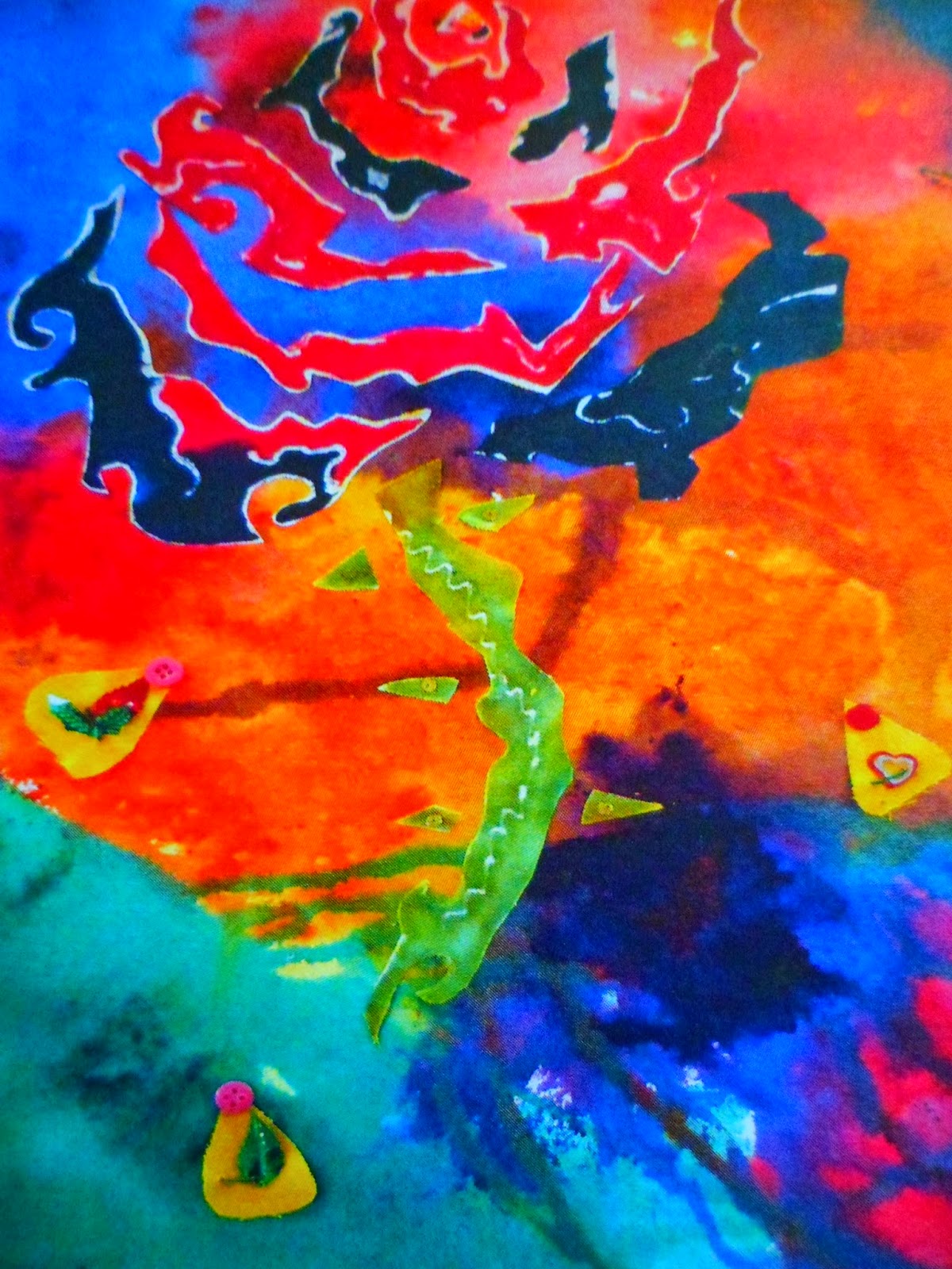
This is my final piece on this topic. First of all, I created the rose using Batic. Then I had to cut it out to stuck on a bright background. I think that the outcome out this has turned out really bad. I should of put it on a pillow instead.